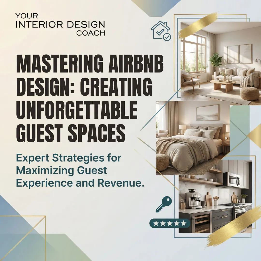
Introduction: Why Airbnb's Design Style Matters for Hosts
Many Airbnb hosts struggle with making their listings stand out in an increasingly competitive market. With millions of active listings worldwide, creating a memorable, trustworthy presence isn't just about clean sheets and good reviews, it's about visual storytelling that builds instant confidence.
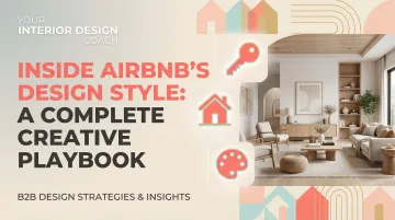
Airbnb's brand recognition is built on more than a clever logo. Their design system has become synonymous with trust, belonging, and quality travel experiences. This article analyzes Airbnb's actual brand design style, their typography, colors, visual language, and creative philosophy, not interior decorating tips for rentals.
Understanding how Airbnb crafted their visual identity can teach hosts valuable lessons about consistency, authenticity, and creating welcoming experiences that resonate with guests before they even book.
TLDR: Key Takeaways from Airbnb's Design Playbook
- Four core principles drive Airbnb's design: unified, universal, iconic, and conversational
- Bélo symbol embodies people, places, love, and Airbnb in one recognizable mark
- Custom Cereal font and warm Rausch pink palette build trust and approachability
- Design Language System (DLS) maintains consistency across millions of touchpoints
- Apply Airbnb's approach using authentic photos and consistent visual branding
What Makes Airbnb's Design Style Unique
The "Belong Anywhere" Philosophy
Airbnb's entire design system flows from their core mission: creating a world where anyone can belong anywhere. This foundational philosophy drives every visual choice. DesignBoom's coverage of the rebrand documented how this philosophy shifted Airbnb from a transactional booking platform to a community-focused brand "rooted in the people."
This translates to design choices that prioritize:
- Warmth over corporate polish , colors and imagery that feel inviting, not sterile
- Inclusivity by default , illustrations and photography representing diverse ages, abilities, and backgrounds
- Human connection , visual language that emphasizes experiences and relationships, not just transactions
These principles shape everything from color psychology to illustration style. The 2014 rebrand brought this philosophy to life visually.
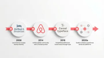
The 2014 Rebrand: A Turning Point
In July 2014, Airbnb unveiled a comprehensive rebrand developed with London-based agency DesignStudio. This wasn't a logo refresh, it was a complete identity transformation.
DesignStudio embedded team members at Airbnb headquarters and traveled to 13 cities, staying with hosts to understand the experience firsthand.
Fast Company's analysis revealed the goal: creating a "marque anyone could draw", a symbol crossing language and cultural barriers to help Airbnb "go mainstream."
Key changes included:
- Moved from the original "puffy, blue-and-white" AirBed & Breakfast logo
- Introduced the Bélo symbol as the new centerpiece
- Developed a bespoke color palette moving away from "dreamy blue and white"
- Created custom typography and redesigned all digital interfaces
- Shifted messaging from functional (rent a room) to emotional (belong anywhere)
The rebrand marked Airbnb's evolution from scrappy startup to sophisticated global brand.
Evolution from Startup to Global Design Leader
Airbnb's design maturity has influenced both travel and tech industries. The company moved from quick-fix startup aesthetics to a sophisticated Design Language System that other companies now study and emulate.
Industry impact includes:
- Popularized the concept of design systems in tech companies
- Demonstrated how emotional branding could differentiate a marketplace platform
- Set new standards for inclusive illustration and diverse representation
- Showed that custom typography strengthens brand recognition across platforms
Their open-source contributions (like react-sketchapp) have helped other companies build their own design systems, establishing Airbnb's role as a design thought leader beyond hospitality.
Airbnb's Visual Identity Breakdown: The Core Elements
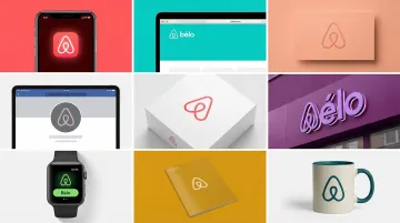
The Bélo Symbol: More Than Just a Logo
The Bélo is Airbnb's most recognizable design element. The name combines four concepts: people, places, love, and Airbnb.
According to DesignBoom, designers created the symbol as something "anyone could draw", whether sketched on a mirror or traced in sand.
It resembles an upside-down heart or an A-shaped birdhouse.
At launch, Airbnb introduced "Create Airbnb," letting users customize the Bélo with their own colors and patterns. The brand belongs to the community, not just the company.
The Bélo's simplicity makes it universally recognizable while remaining flexible enough to adapt to different cultural contexts.
Color Palette: Warm, Welcoming, and Intentional
Airbnb deliberately moved away from the "cold, corporate blue" typical of tech companies. Their primary color is Rausch, a bespoke red-pink hue named after Rausch Street in San Francisco, where the founders started Airbnb.
Primary colors include:
- Rausch , Warm coral-pink representing passion without aggression
- Kazan , Supporting red named after the Russian city, part of a secondary palette drawing names from world locations
These warm tones evoke trust and approachability, adventure and energy, plus warmth and welcome. Pink undertones soften red's intensity, while coral tones feel inviting rather than corporate.
The palette includes secondary colors (teals, yellows) used contextually, but Rausch remains the signature brand color across all touchpoints.
Typography: Airbnb Cereal Font
To ensure brand distinction and legibility across all platforms, Airbnb developed a custom typeface called Airbnb Cereal, a playful nod to the company's early fundraising days when founders sold novelty cereal boxes (Obama O's and Cap'n McCain's).
Created in partnership with type foundry Dalton Maag over 18 months, Cereal launched in May 2018.
Key characteristics:
- Geometric structure with rounded edges for friendliness
- Optimized legibility across mobile screens to large billboards
- Distinguishable character combining function with personality
- Multiple weights for hierarchy and emphasis
The custom typeface replaced Circular, giving Airbnb complete control over their typographic voice while ensuring readability for a global audience.
Iconography and Illustration Style
Airbnb's illustration guidelines follow four principles: Grounded, Scalable, Lightweight, and Diverse.
The brand moved from a "bubbly, childlike" aesthetic to minimal, lightweight illustrations with intentional white space. According to Airbnb's design team, the goal is representing the global community authentically.
Guidelines require referencing real photos to avoid stereotypes, accurate representation of different races and ages, authentic depiction of the disability community, and including visual cues like prosthetics.
Icons follow consistent principles: simple, line-based designs with uniform stroke weight that work across sizes and contexts.
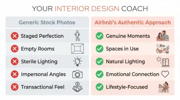
Photography and Imagery Guidelines
Photography is central to Airbnb's "Belong Anywhere" narrative. DesignStudio's work with Airbnb established principles focusing on "real people and places" rather than generic travel stock photos.
Photography principles include:
- Authentic over staged , capture genuine moments, not posed perfection
- Diverse representation , show the breadth of the global community
- Well-lit and inviting , natural light that makes spaces feel warm
- Lifestyle-focused , show spaces in use, not empty rooms
- Emotional connection , capture the feeling of belonging, not just the transaction
This approach shifts visual language from transactional (price/location) to emotional (warmth/welcome/connection).
Airbnb's Design Language System (DLS)
A Design Language System is a complete set of standards for managing design at scale using reusable components and patterns. Airbnb created their DLS to solve a specific challenge: unifying design and engineering across platforms as they scaled.
As Airbnb grew from a simple booking site to a platform offering Homes, Experiences, and more, maintaining consistency became critical. The DLS provides a shared vocabulary. Teams can now build features as "parts of a greater whole."
Core System Components
Key components:
- Reusable design elements , buttons, forms, cards, and navigation patterns defined once and used everywhere
- Cross-platform consistency , components work identically across iOS, Android, and web
- Spacing and layout guidelines , systematic rules for margins, padding, and responsive behavior
- Shared documentation , designers and engineers reference the same component library
Keeping Design and Code in Sync
Airbnb built react-sketchapp, an open-source library rendering React components to Sketch. Design files match production code exactly. Translation errors disappear.
A dedicated DesignOps team maintains the system, functioning like DevOps to provide agility through centralized tools. This governance structure allows the DLS to evolve as the company grows while maintaining consistency.

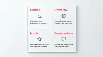
Key Design Principles from Airbnb's Playbook
Airbnb's design decisions follow four core principles that ensure every element serves the brand mission. For anyone designing spaces, whether Airbnb listings, homes, or client projects, these principles offer a framework for creating cohesive, memorable experiences.
Principle 1: Unified
Every piece must contribute to a cohesive whole. There are no isolated features or visual outliers.
Design elements work together systematically, not as one-off solutions. Consistency is maintained across geographies while allowing localization, and the experience feels seamless whether booking on mobile, web, or through customer service.
When applied to interior spaces, this means every design choice, from furniture to lighting to color, should feel intentionally connected rather than randomly assembled.
Principle 2: Universal
Airbnb serves a global community, so the visual language must be welcoming and accessible to everyone.
Key applications include:
- Accessibility first , legible typography, sufficient color contrast, screen reader compatibility
- Multilingual support , design accommodates text expansion for different languages
- Cultural sensitivity , imagery and examples represent diverse contexts
- Inclusive representation , illustrations authentically depict people of all abilities, ages, and backgrounds
This approach ensures no user feels excluded. For Airbnb hosts, it means creating spaces that welcome diverse guests through thoughtful, inclusive design choices.
Principle 3: Iconic
Design should be focused and memorable, speaking boldly and clearly without overwhelming users.
Airbnb maintains distinctiveness without sacrificing usability. The Bélo symbol, Rausch color, and Cereal typeface are all immediately recognizable while remaining functional. Users instantly recognize Airbnb's visual language, building trust through familiarity.
In practice, this means choosing 2-3 signature elements that define your space rather than trying to incorporate every trend.
Principle 4: Conversational
Motion and interaction breathe life into the product, communicating in easily understood ways.
Airbnb uses friendly, clear language instead of corporate jargon, interface copy feels human, not robotic. Animations and transitions guide users naturally through tasks without requiring explicit instruction, making the platform feel approachable and intuitive.
For interior designers and hosts, this translates to creating spaces that feel welcoming rather than intimidating, with intuitive layouts that guide guests naturally through the experience.
How to Apply Airbnb's Design Approach to Your Rental Property
Create Consistent, High-Quality Listing Photos
Your listing photos should follow Airbnb's visual principles:
- Use natural light , shoot during golden hour or with windows open
- Show spaces in use , include lifestyle shots (coffee on the table, book on the chair)
- Maintain visual consistency , use similar editing style, color temperature, and composition across all photos
- Be authentic , capture your space genuinely, not overly staged perfection
Studies confirm this approach works: high media richness significantly influences trust and booking intentions, with detailed visualization reducing customer uncertainty.
Design Your Listing Description with Clarity
Your listing copy should mirror Airbnb's conversational approach:
- Write in a welcoming, jargon-free voice
- Use short paragraphs and bullet points for scannability
- Be specific about amenities and location (not vague marketing speak)
- Answer common questions upfront
Compare these approaches:
Generic: "This world-class property offers cutting-edge amenities in a prime location."
Specific: "You'll have a dedicated workspace with fast WiFi, a fully stocked kitchen, and a 10-minute walk to downtown restaurants."
Build a Cohesive Visual Identity for Your Space
Beyond individual listing photos, think about your overall visual presence. A cohesive design approach builds recognition:
- Single-property hosts: Select 2-3 accent colors that appear in textiles, art, and decor
- Multi-property portfolios: Develop a recognizable style (modern minimalist, cozy traditional, etc.) that carries across listings
- Photography consistency: Use the same photographer or editing presets for all properties
This creates a "mini brand" that builds recognition and trust with repeat guests.
When You Need Design Help: Working with a Professional
If you're stuck translating these principles to your space, YIDC offers design coaching for Airbnb hosts. With almost 20 years of experience, Miriam Saadati helps hosts who are overwhelmed by design decisions or need creative problem-solving support.
YIDC provides staging feedback and practical guidance to help your property compete with local listings, walking you through the process from concept to implementation.
Lessons for Hosts from Airbnb's Creative Strategy
Consistency Builds Trust
Nielsen Norman Group research confirms that strong first impressions form in as little as 5 seconds. Maintaining consistent quality across all touchpoints increases bookings and builds trust.
For hosts, this means:
- Consistent photo quality and editing style
- Matching the space description to actual amenities
- Reliable communication tone from listing to check-out
Authentic Storytelling Wins
Airbnb's shift to "real people and places" photography reflects what guests actually want: authenticity over staged perfection. Genuine, human-centered content performs better because it builds connection.
Research shows that detailed, authentic visualization minimizes customer uncertainty and directly affects booking decisions.
Simplicity Enhances Usability
Airbnb's design system prioritizes clarity and removes mental effort. Clean, uncluttered spaces and communication improve the guest experience from first click to checkout.
For hosts:
Keep house manuals clear and concise
Avoid cluttered spaces in photos
Provide straightforward check-in instructions
Use simple, consistent formatting in all communications
Use simple, consistent formatting in all communications
These principles apply beyond listings. If you're an Airbnb host looking to refine your space's design or need guidance on creating cohesive, guest-friendly interiors, Your Interior Design Coach works specifically with hosts to solve design challenges within budget constraints.
Frequently Asked Questions
What is Airbnb's design philosophy?
Airbnb's design philosophy centers on "Belong Anywhere," prioritizing human connection, inclusivity, and warmth over corporate aesthetics to make users feel welcomed and valued.
What colors does Airbnb use in their brand?
Airbnb's primary color is Rausch, a warm coral-pink named after the street where the company was founded. The secondary palette includes Kazan red and supporting colors named after world cities, creating a warm, approachable alternative to typical tech company blues.
What font does Airbnb use?
Airbnb uses Airbnb Cereal, a custom typeface created with Dalton Maag that combines geometric structure with rounded edges for friendliness and legibility across all platforms.
How can I apply Airbnb's design style to my rental property?
Use consistent, naturally-lit photography showing spaces in use, clear conversational descriptions without jargon, and a simple color palette maintained throughout your property.
What is the Bélo symbol and what does it mean?
The Bélo represents four concepts: people, places, love, and Airbnb. It was designed as a universal symbol anyone could draw, transcending language barriers to communicate belonging and community across cultures.
Does Airbnb have design guidelines for hosts?
Airbnb's brand guidelines govern their platform, but hosts can apply these principles to property presentation by focusing on authenticity, consistency, and clear communication.